
At mkk – meine Krankenkasse, one of our primary digital product is the mobile app. The mkk app was specifically developed to provide online digital services and support for health insurance customers.
Over the years, the app's roadmap has evolved and became more feature-rich. In a team with another fellow designer, I had the chance to research and conduct usability testings to validate our concepts before handing-them-off to the developer team.
250k+
Monthly Users
4.7
App Store Rating
Team
Product Manager, Product Designer, App Developers
Main Challenges
The work on this project began with brainstorming session and defined what challenges we faced as a team as well as our current technical capabilities. During the whole project I and my Product Designer peer held continues feedback session with the Product Manager and the Developer to ensure we stayed on the right track.
Users
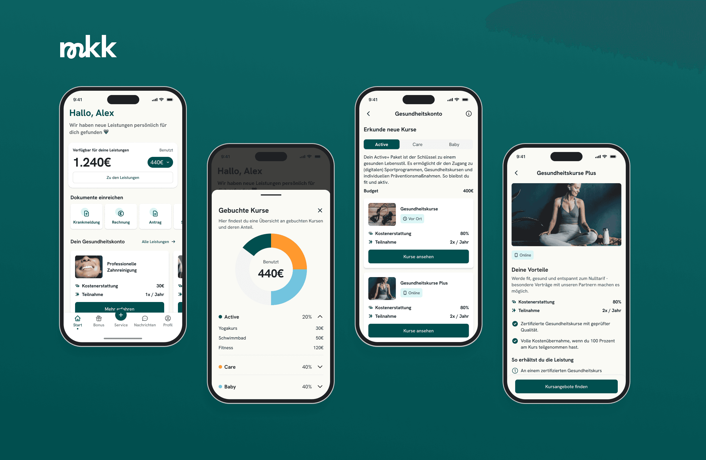
How can we simplify the course booking process for mkk customers while ensuring cohesive UX within the app?
Company
How should we integrate the new feature considering current app architecture and development capabilities?
Our Hypotheses
On the initial kick-off session of our product team, we collected all questions and thoughts on the new health account feature for the app. We started with the question of proper naming and ended how user should complete the flow. Totally we created 20+ research hypotheses for testing and validation.
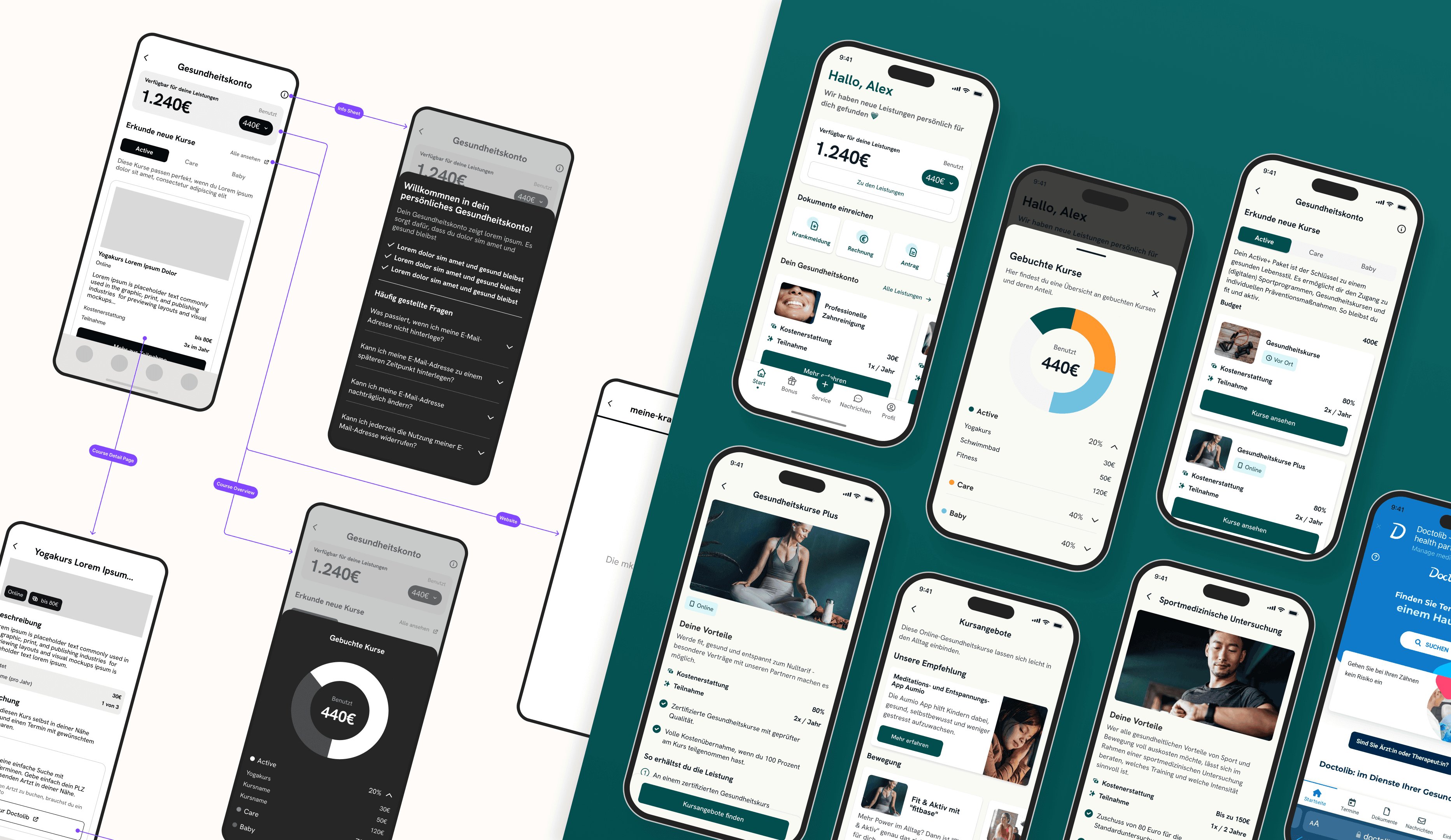
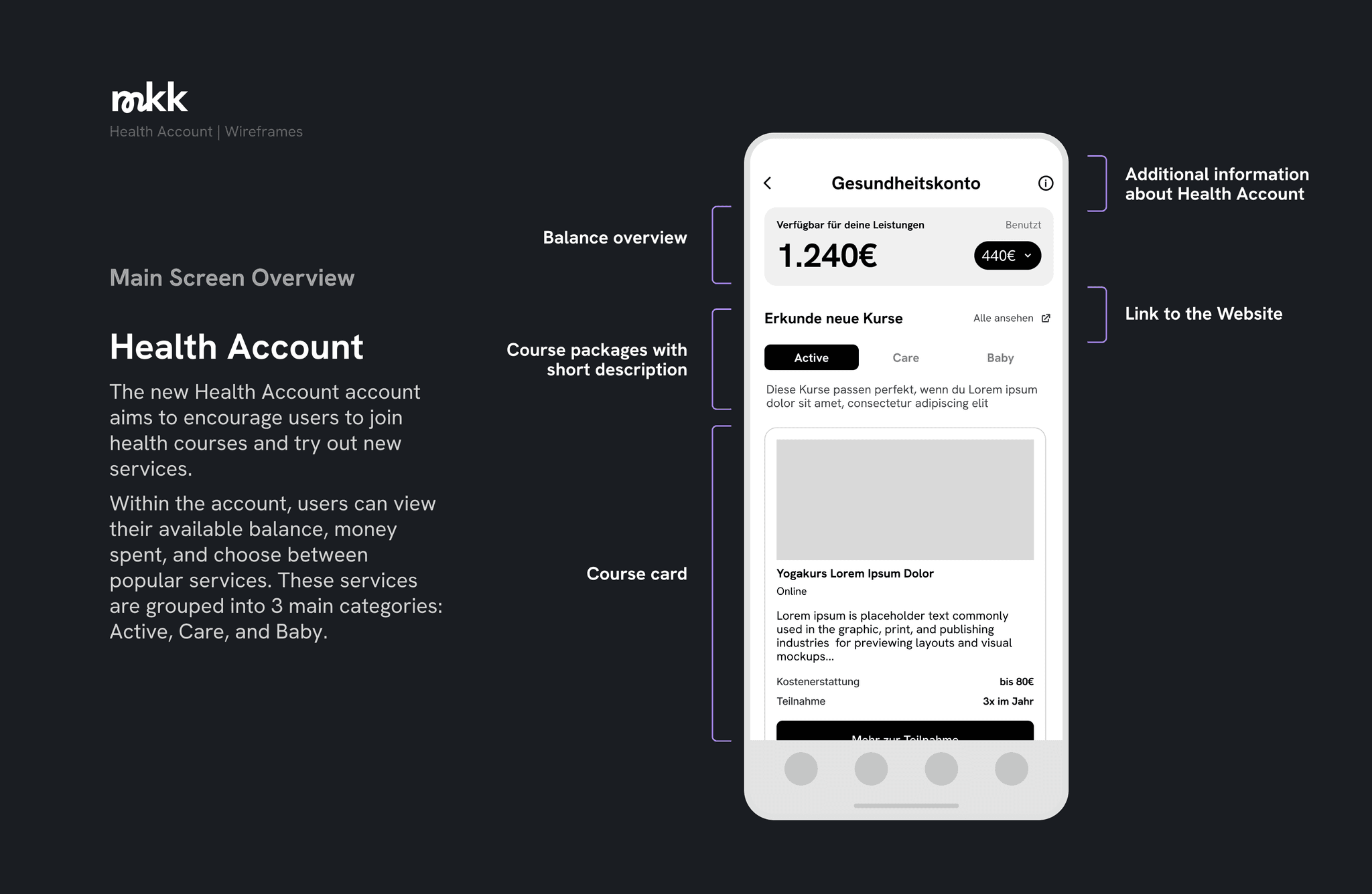
Shaping the Ideas
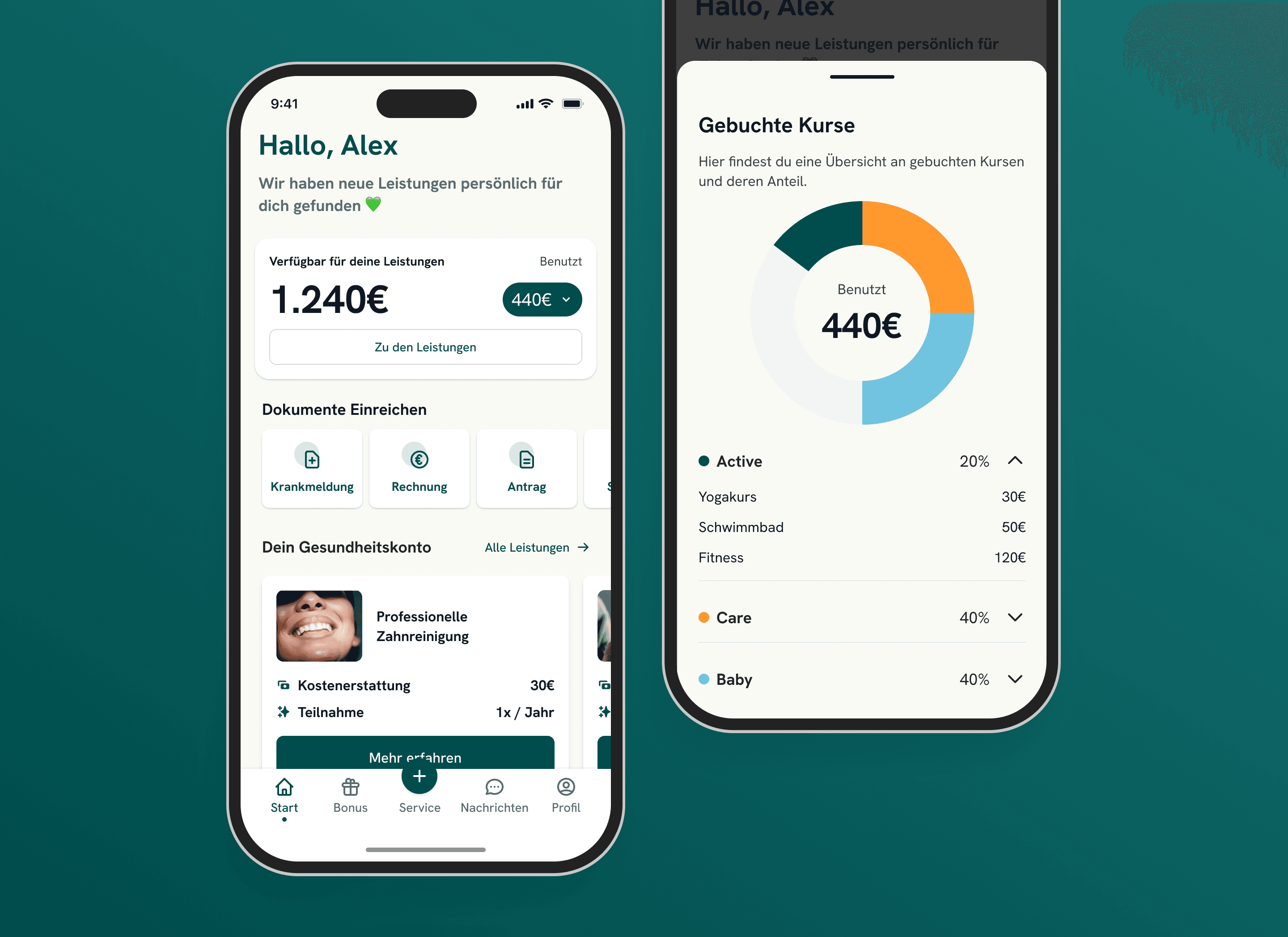
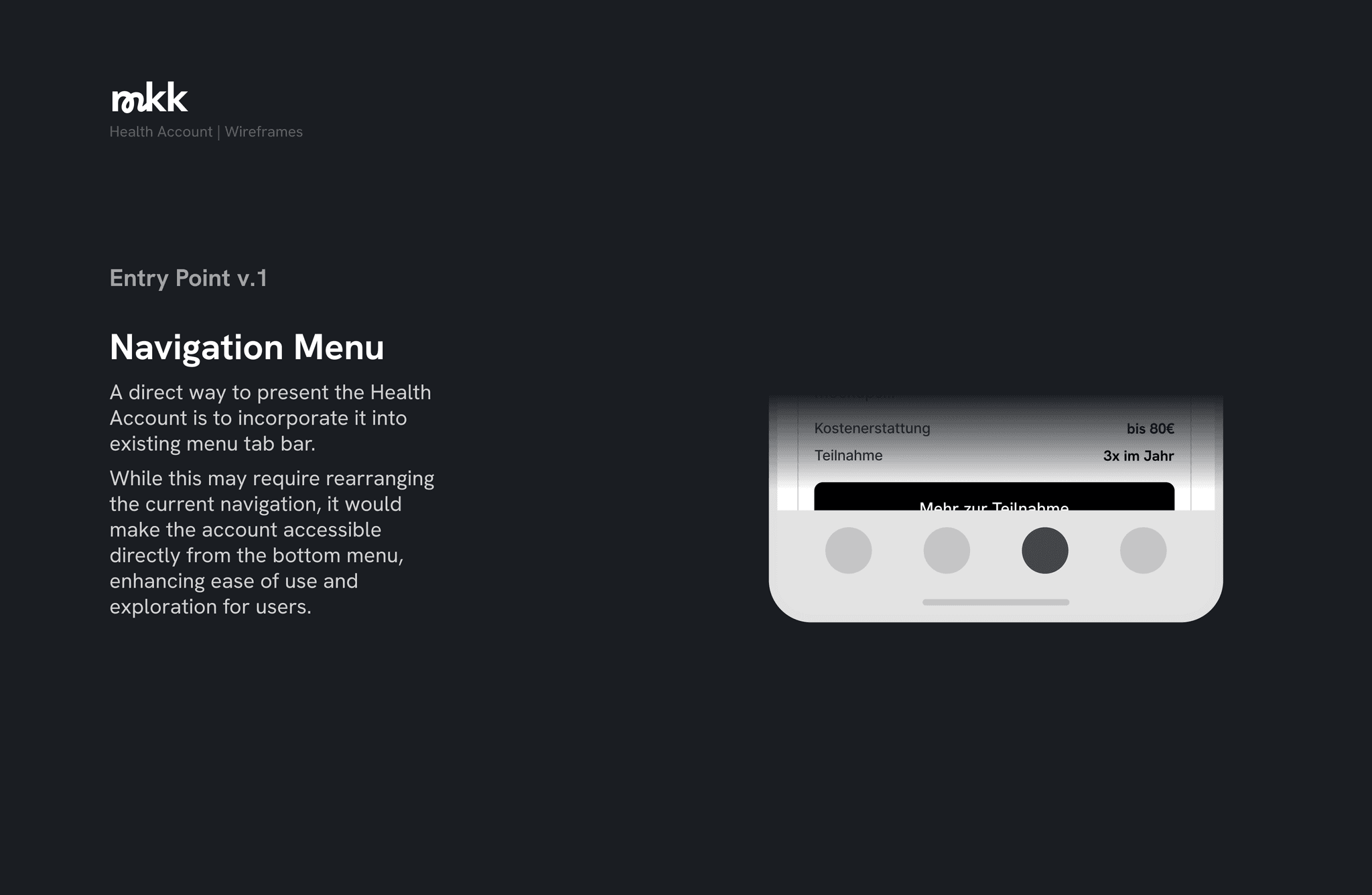
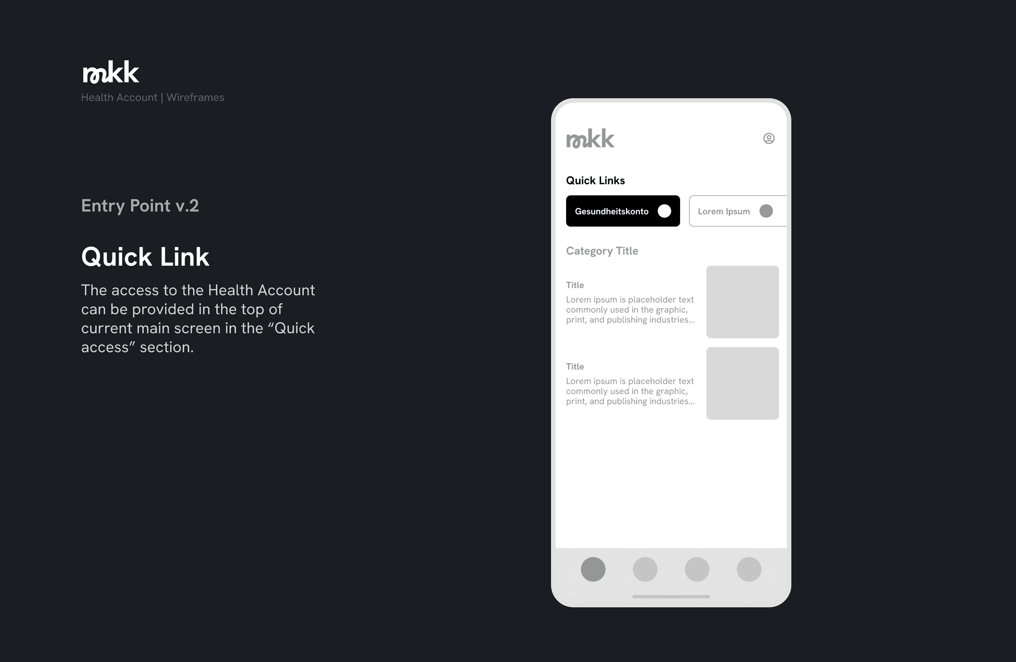
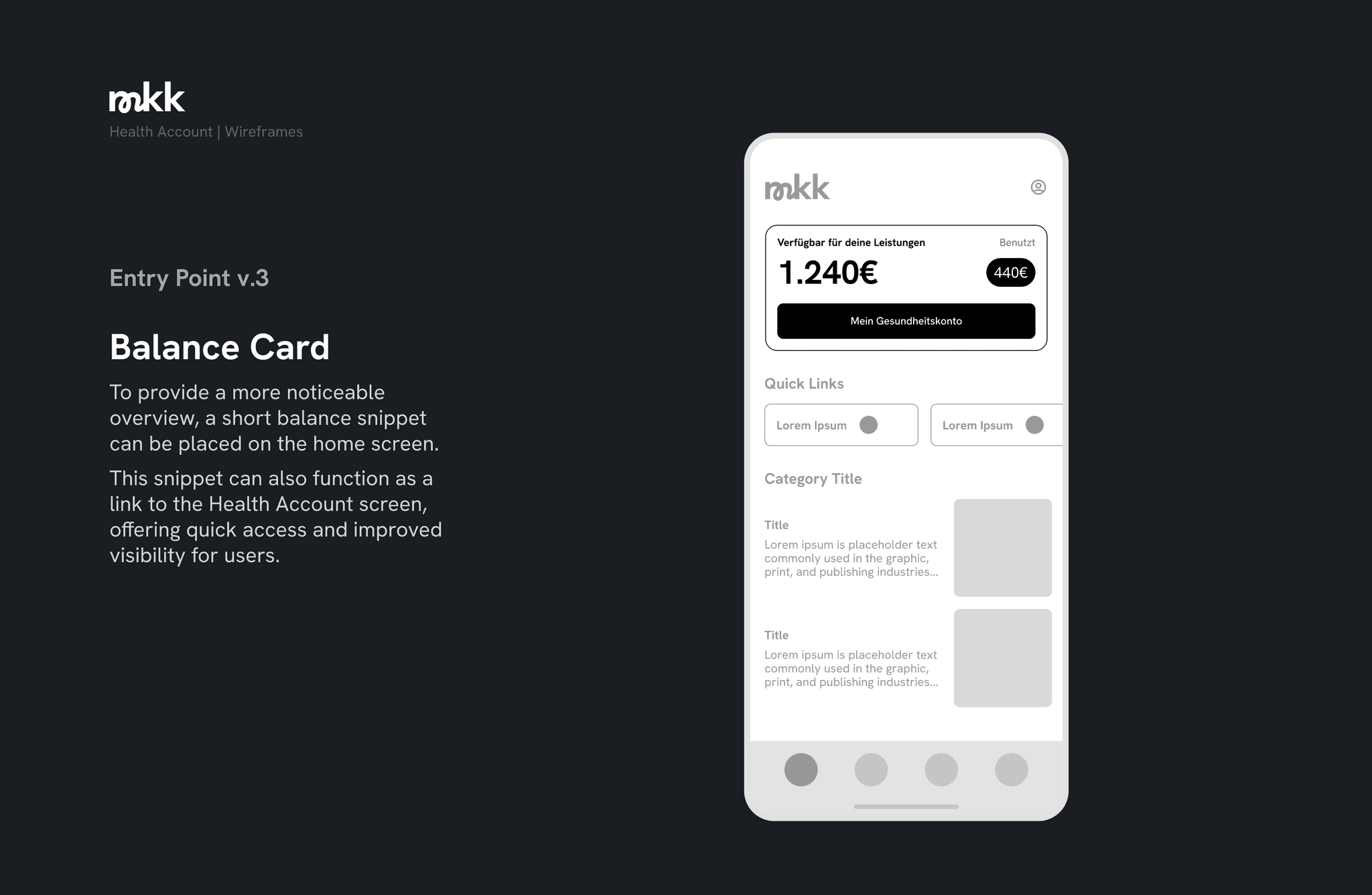
Before diving into the research phase, I started to develop the new feature concept based on our raw ideas and suggestions. One of the main challenge during this first step was to gain a clear understanding of users' navigation pattern within the existing app architecture and create a clear entry point to the new health account.
Research Questions
Our research goals were primarily focused on exploring users' perceptions and evaluations of the new feature. We also wanted to rate the simplicity of our prototypes, as well as the effectiveness of screen navigation and information architecture.
Our main research question included:
How easy could users find information about a health course and book it?
How comfortable would they feel with the new definition “Gesundheitskonto”?
What can we learn from their impressions and feedback on our feature?
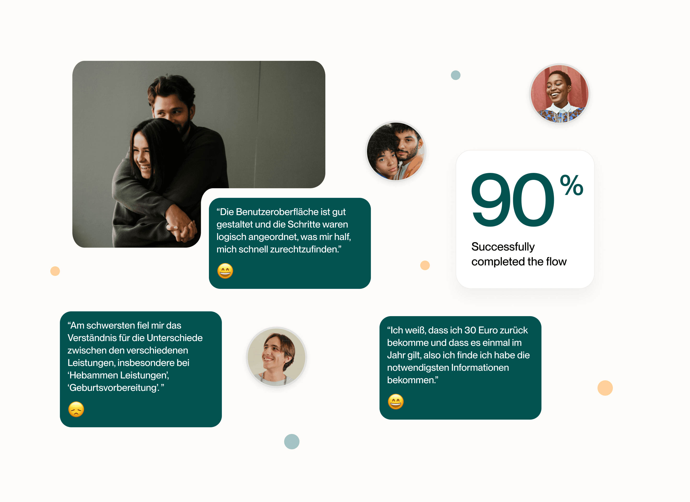
Research Insights
For our research sessions we reached out to existing customers as well as users from an external provider. We aimed to test our hypotheses on users with and without experience with the mkk app. This approach broadened our understanding of what users were really looking for.
One of our key insights from the usability testing was the "First click" navigation users made on the screen. By analyzing user behavior across different concepts, we discovered that some users navigated to the "Profile" icon, while others expected a full list of courses to be displayed directly on the main screen. As a result, we needed to make several adjustments to the prototypes and test them again.
Design Improvements
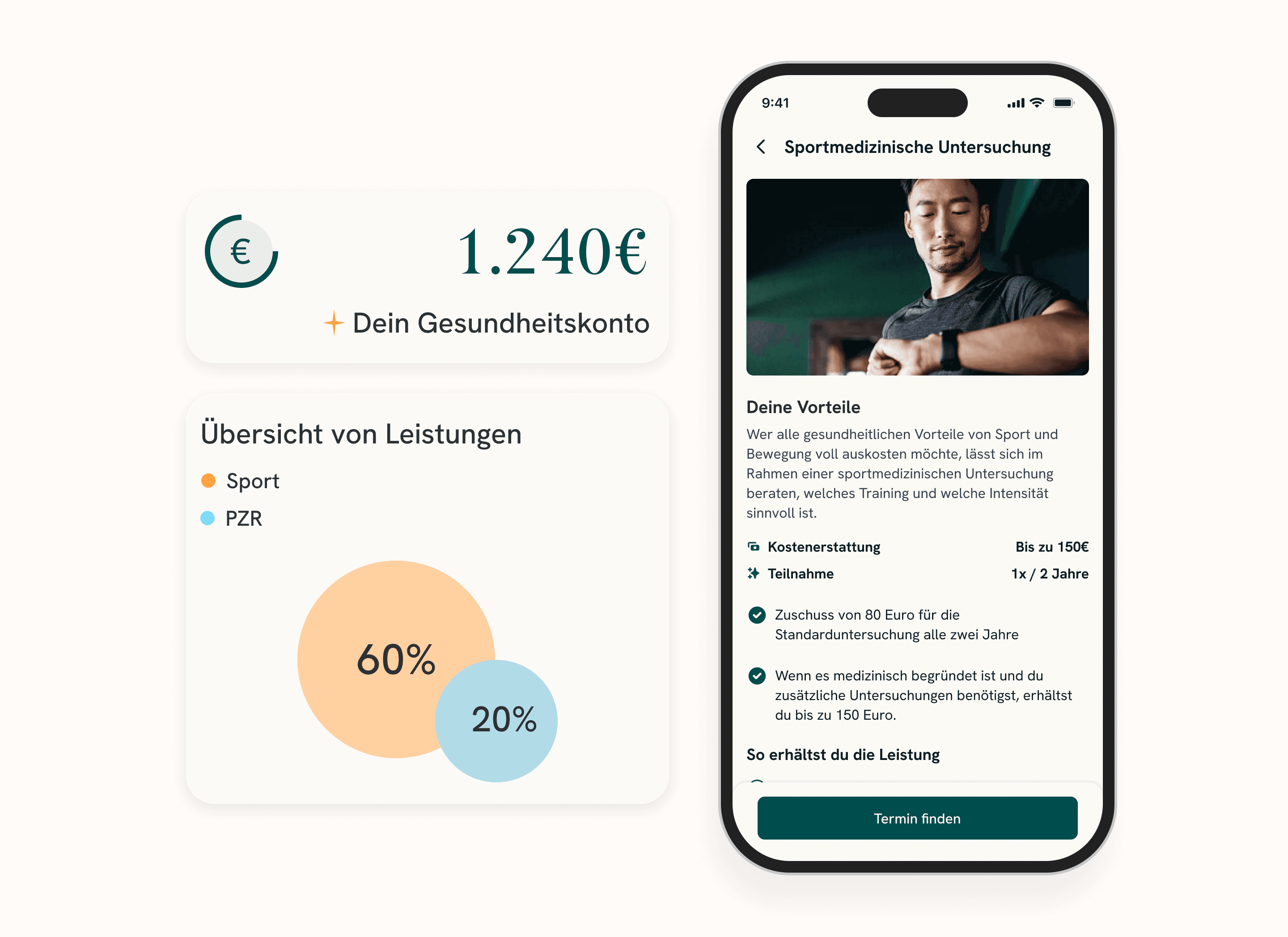
After gaining a clear qualitative and quantitative data from our research and usability testing, I was able to create more detailed designs. Conducting user interviews was extremely helpful for us as they guided us in the next steps of design phase.
We also tracked how users navigated the booking flow, selected courses, and made decisions, noting where they clicked and how they thought during the whole process. This user-centered design approach helped us reduce the risk of future app updates that might cause unexpected issues for users.
Main goals
Project Results
The iterative methodology we applied in this project helped our team avoid major problems and make the new Health Account experience more comfortable for the user. We also tend to think that it will make a significant impact on all app users after the next big app version release.
By the the end of project, our team conducted 5 moderated interviews, 8 unmoderated usability testings, and iterated on 3 versions of the prototype of the new feature.
After the Launch
The introduction of the new Health Account will occur in upcoming app releases, with new features being rolled out incrementally. Once it’s launched as planned, it will be essential to track key metrics for further improvement. The main metrics could be the booking-flow conversion, along with monitoring the most popular courses to enhance their visibility.